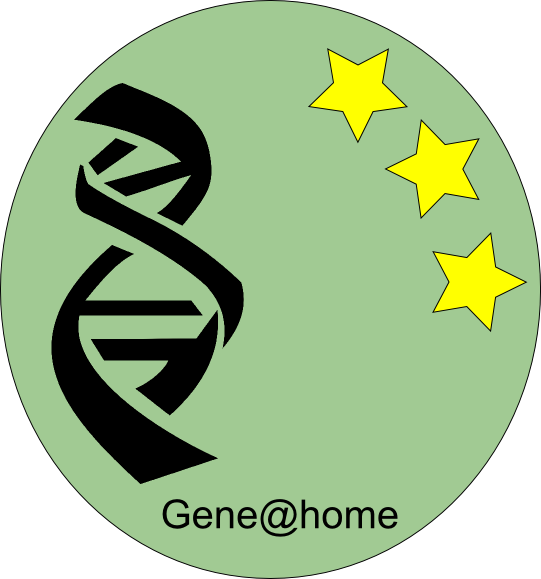
This is just a design think-tank. We don't have yet decided how to grant users appropriate credits for the job done, so milestones are by now meaningless. However we are thinking (in the spare time) about badges. The following is just a prototype, with random colors and casual positioning and a wrong aspect ratio. Please give comments

I like it.
What I'd point out though is that the badges from most projects are fairly small to show up on signatures so you have to see how they scale.
28x28 or 40x40 or something like that.
The following is just a prototype, with random colors and casual positioning. Please give comments
I like it, despite this "kind of green"...
Another one (bronze sample), the red circles are 'badge levels' (from 0 to 3 or from 1 to 3) That's for the credit badges.

Just to summarize the whole thing:
- The design of the badge(s) is almost definitive, we need to check its appearance when scaled to 40,60 pixels.
- The levels inside a badge will be something like
0k - Bronze (with levels, circles) (0 to 2, or 1 to 3, maybe 0 to 3) like 10k,25k,50k
100K - Silver 100K, 250K, 500K
1M - Gold 1M, 2.5M, 5M
and so on, in case.
- We have to decide whether to implement this using the new boinc standard way for badges (like the ones on seti@home) or putting some custom code here and there. First choice is easier to implement but badges are not given in real time.
Obviously this is a low priority issue... but, anyway, comments and suggestions are welcome
- The levels inside a badge will be something like
0k - Bronze (with levels, circles) (0 to 2, or 1 to 3, maybe 0 to 3) like 10k,25k,50k
100K - Silver 100K, 250K, 500K
1M - Gold 1M, 2.5M, 5M
and so on, in case.
Like asteroids@home (different color for different level), for example.
I don't like very much badge for RAC...
I don't like it either... (but that's for free, the coin rac badges were really easy to implement)
I just wanted to keep this thread alive, is there any comments about badges (credit badges, not rac badges)
I just wanted to keep this thread alive, is there any comments about badges (credit badges, not rac badges)
Yeap. Credit badges, with different colours, is a good idea.
Like WCG subprojects....
Any news about badges??
Any news about badges??
I need to find some time to think about (it's a low priority issue...).. I need also to make nice looking small images, this one is 60x60 pixel (probably too much for a 'standard' badge)

Any news about badges??
I need to find some time to think about (it's a low priority issue...).. I need also to make nice looking small images, this one is 60x60 pixel (probably too much for a 'standard' badge)

I'm not sure what your purpose is with the intermediate levels (1, 2 or 3 dots). Perhaps the dots mean something in gene science?
My suggestion is to merely follow the same scheme as almost all projects. Have your basic logo (in this case the DNA strand) and the badges have background colors to denote levels. Removing the dots will make it easier to reduce the size of the badge
If/when you add other sub-projects, then you only have to change the logo to generate the badges.
Cheers!
S.
I second Steve's message.
Has there been any updates on this topic now that it has gone 11 months without update?
____________

I was thinking about this and it seems that the dots might just add an extra level of complexity to the creation of the badge.
For example with 3 dot system,
get Bronze badge at 10,000 with no dots
at 25,000 retain Bronze badge but add a red dot
at 50,000 retain Bronze badge retain red dot add another red dot
at 75,000 retain Bronze badge retain 2 red dots, add another red dot
That is 4 levels of Bronze and the code to go with it.
This is then repeated for Silver, Gold an upwards, creating lots of levels.
I was thinking that it would be easier to not use the dots at all (which will reduce the badge size) and just have one extra level for each badge but change the clour ot the DNA strand instead of adding dots.
So Bronze gained at 10,000 with the red DNA strand.
At 50,000 change the DNA strand to white (for example)
Silver gained at 100,000 with the red DNA strand
At 250,000 change the DNA strand white
Gold gained at 500,000 with the red DNA
At 750,000 change the DNA strand to White
Amethyst gained at 1,000,000 with the red DNA
At 2,500,000 change the DNA strand to white
Sapphire gained at 5,000,000 with the red DNA
At 7,500,000 change the DNA strand to white
Emerald gained at 10,000,000 with the red DNA
At 15,000,000 change the DNA strand to white.
This is my suggestion and the colours can be changed around so they are easy to see.
Just another possibility.
Conan
Good idea (changing the color of the DNA strand). I promised (well, to myself only) to set up the badge system before the end of this here. We'll see.
Thank you for the hints.
We can wait, if you have more important stuff to do (and I'm pretty sure that's true) then do it first ;)
I see badges... not what was proposed, but I like it!
Are the badges the coins to the left?
Are the badges the coins to the left?
The coins are some kind of badge. That's the 'standard' way introduced by boinc some time ago to give badges for the RAC (like the ones you may see in seti@home). This kind of badge is not permanent, if your RAC goes down you loose them. The ones that I would like to implement (if I'll find the time) are the classic 'milestone' badges. The usual way, if you reach, say, 1M you get one and keep it forever.


